
Why This Piece Exists
BRIEF
Improve Adding Scores, Refresh The UI
RESEARCH
3 Competitors, 8 Survey, 2 Tested
PRODUCT
WODboard, Not Mine
OUTPUT
Hi Fi Prototype
01 / The Catalyst
That line came out of testing the app where it actually gets used. Not at a desk. On a gym floor, sweating, out of breath, with a coach already setting up the next piece.
Every tracking app I looked at was designed as though the user was sitting still and paying attention. They are not. They have about fifteen seconds and one free hand.

02 / What I Found
Before touching WODboard I looked at what it was up against. Wodify, Beyond the Whiteboard and SugarWOD. Most of them sit behind a paid subscription tied to a gym programme, so I worked from user reviews and sales material rather than pretending I had deep access to all three.
Four things came back repeatedly across all of them. People want the app to stay up. They want an interface that does not need learning. They want useful data without a wall of metrics. They want to share what they did.
Then I ran my own survey with eight WODboard users and sat two of them through the current score logging flow.
The single biggest pain point in both the survey and the usability test. Not a nice to have. The core action of the product.
If you had already logged scores across a workout, you had to navigate to the last score you entered before you could add a new one. A dead end dressed up as a flow.
Difficult to navigate, and finding a relevant previous score was cumbersome. The data was there. Getting to it was the problem.
Programming is written in percentages of a max. The app knew the max and made people do the maths themselves.
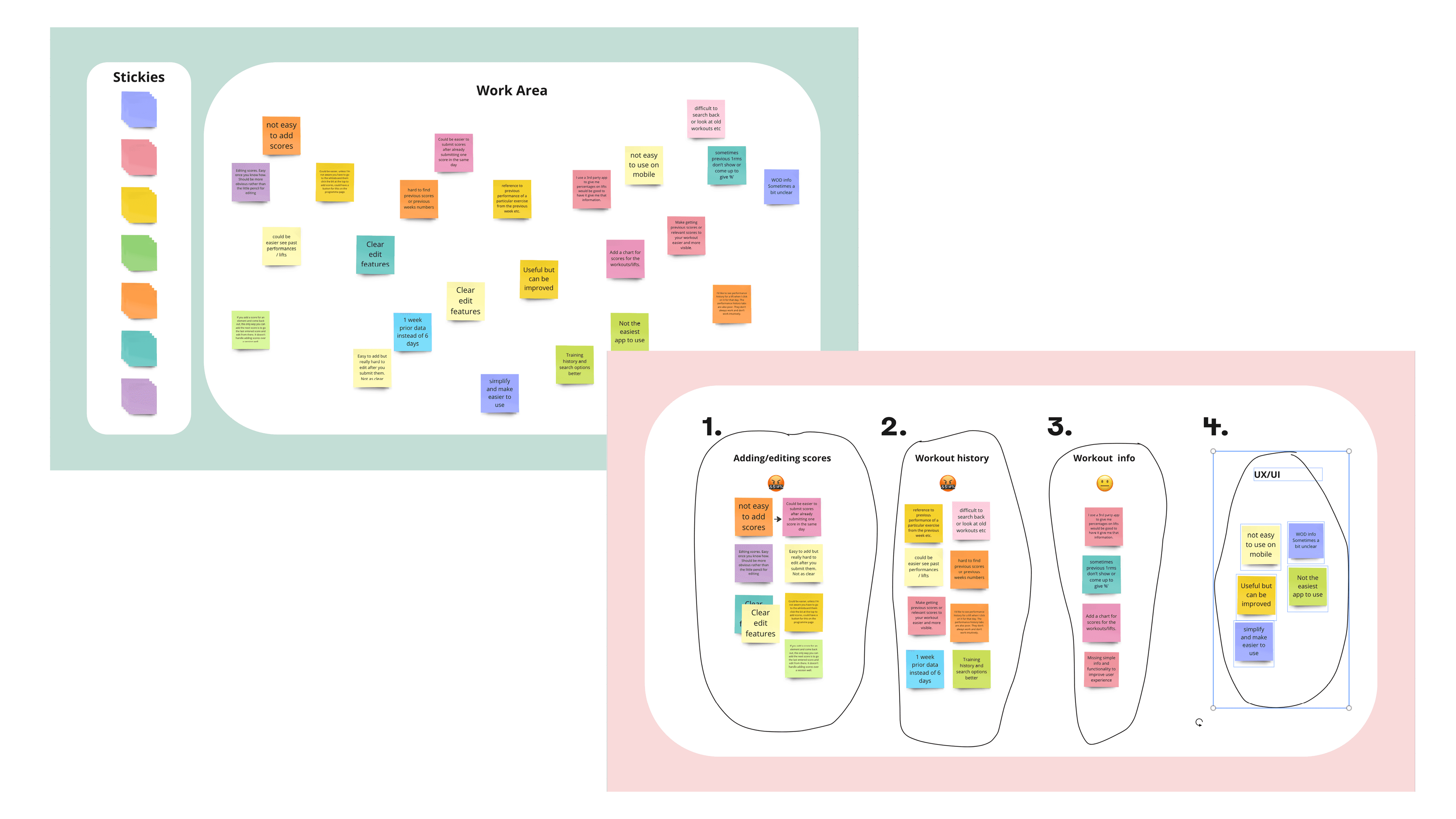
I did the affinity mapping solo, which is a constraint worth naming. One person grouping their own notes will find the groups that person expects. It gave me an order to work in rather than an objective truth.
The order I landed on: adding and editing scores, then workout history, then workout information. The fourth theme was UI and UX generally, and I treated that as something I would fix by solving the first three rather than as a separate job.
03 / Decisions
The interaction was the whole problem, and grey boxes cannot show you an interaction.
Obvious solution
Wireframe first, get structure agreed, then apply visual design. Standard process, easy to defend.
What I did instead
Went straight to a high fidelity prototype. The pain point was tapping, not layout. A wireframe would have told me nothing about whether the flow felt fast, and the visual refresh was part of the brief anyway.
The thing I needed to judge was speed of interaction, so I built the thing that could be judged on it.
The top of the dashboard belonged to things nobody used
Obvious solution
Leave notifications and the consistency graph where they are. They sit in the most prominent position on the screen, so presumably somebody decided they mattered.
What I did instead
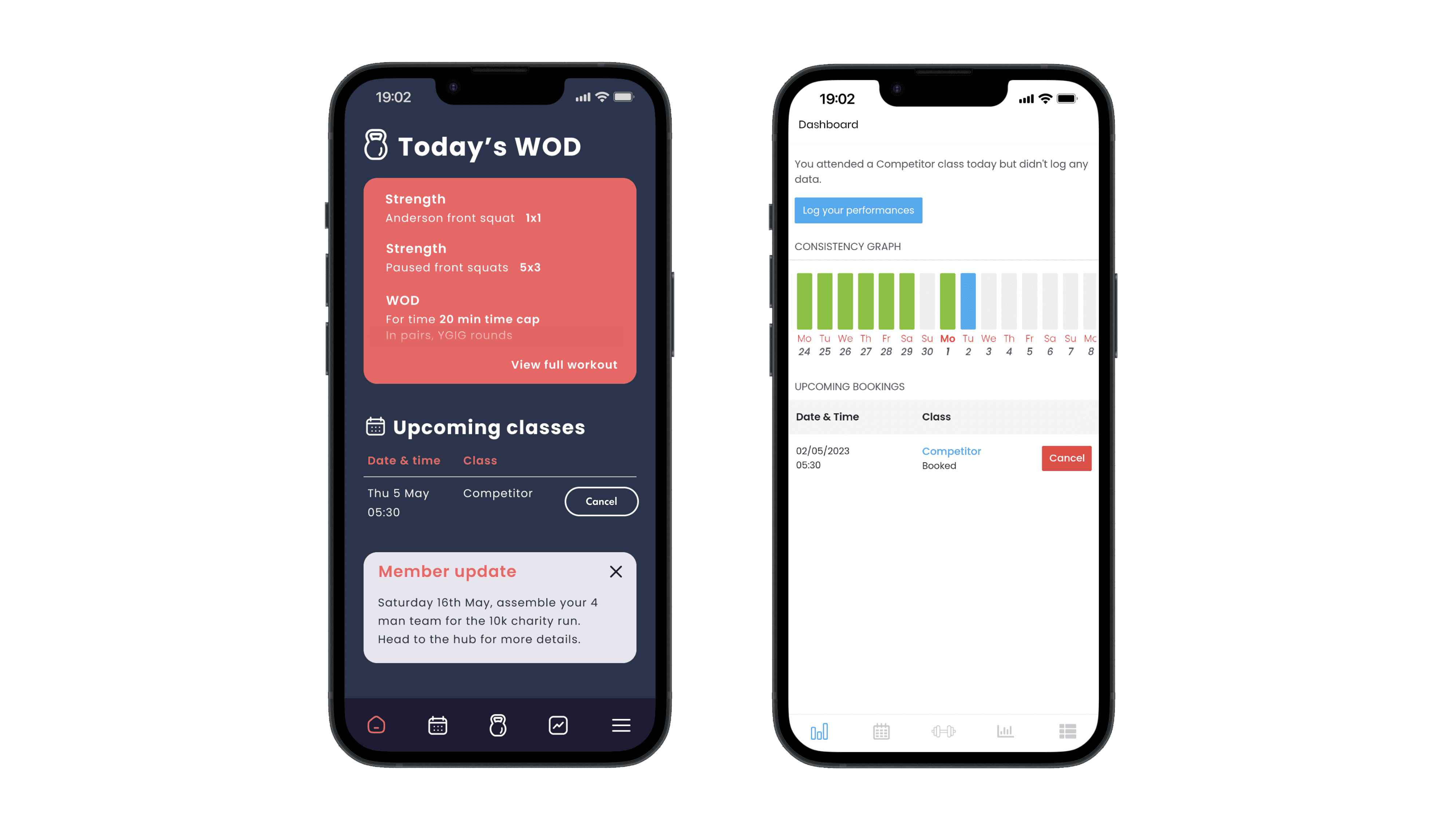
Testing showed users did not really use the consistency graph. Notifications at the top also pushed everything below them around as they came and went, so the layout moved under your thumb.
I moved notifications to the bottom, which stopped the sections underneath from jumping and freed the top of the screen for something people open the app for.
The reason you open the app was one tap away from the first screen
Obvious solution
Keep the dashboard as a summary and the workout as its own destination. Clean separation, tidy information architecture, nothing to argue with.
What I did instead
I put a snippet of today's WOD directly on the dashboard. Tidy architecture is not worth much if it adds a tap to the only journey that matters.
The app now opens on the reason you opened it.
A workout was a block of text, so nothing in it could be acted on
Obvious solution
Keep the workout as a single readable block and put the actions in a toolbar or behind an overflow menu.
What I did instead
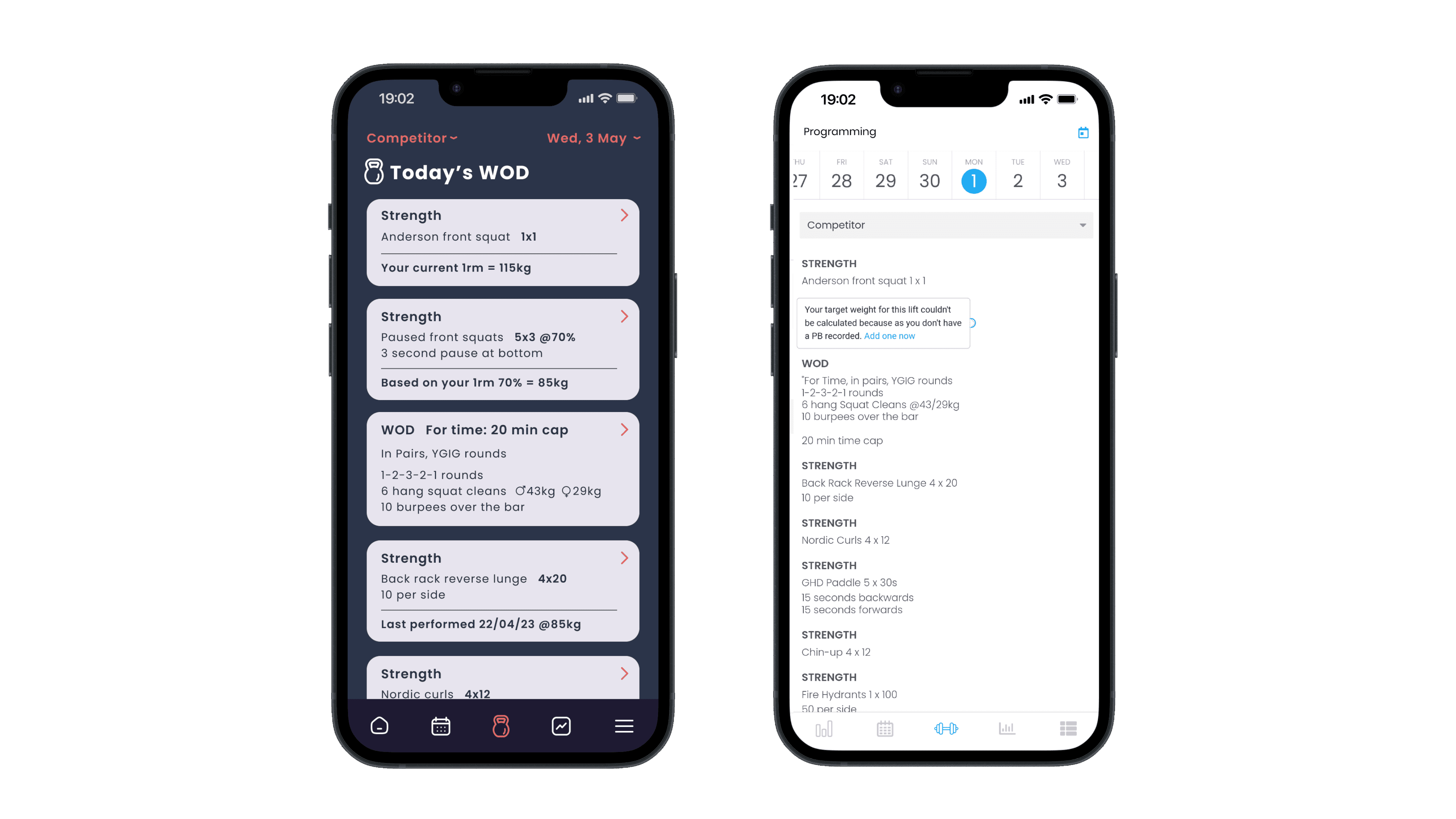
I split the workout into separate cards, one per component. Each card is actionable in its own right and carries the relevant information at a glance. Previous notes and suggested weights sit on the card with no extra interaction needed.
The information people were digging through history for now sits on the thing they are about to do.
Four ways in, four detours
Obvious solution
Rationalise four entry points down to one clear one. Fewer paths, less confusion, job done.
What I did instead
I removed the detour entirely. Adding and editing happens directly on the workout component, so the WOD itself becomes the point of interaction rather than a signpost pointing somewhere else.
That also clears the last score trap. You are never navigating to a previous entry in order to reach a new one, because there is nowhere to navigate to.
People lost track of what they had already logged
Obvious solution
Let people check their history at the end of the session to see what is missing.
What I did instead
I put a completion mark on each component. Logged or not logged, visible on the workout itself, in the moment.
You can see what you have missed while you are still standing next to the bar, not that evening when you cannot remember.

Usability testing, in the gym
04 / What Happened
The role went to a candidate with more proven experience, which was fair. I was asking an agency to take a fifteen year graphic and digital designer on trust as a UX hire, and someone in the room had already done the job.
What they said about the work was that the presentation was well reasoned, and that I should take it to WODboard directly. I have since made contact with someone who works there and the work is going to her.
Losing on experience rather than on thinking was the outcome I could live with. It was the closest I got before the move actually happened.
05 / What I Learned
Test It Where It Gets Used
Running the usability test in the gym rather than at a desk produced the insight the whole redesign hangs on. Nobody would have said the words "sweaty" or "ten minutes later" sitting in a quiet room. Context was not a nice detail, it was the finding.
Solve The Core Action First
Four themes came out of the research and the fourth was UI and UX. I did not treat that as its own workstream. Fixing the first three fixed most of it, because the interface felt bad largely because the main job was hard.
A Well Run Process Is Not The Same As Good Judgement
I ran every step properly and I still accepted the shape of the problem exactly as it was handed to me. Process is what you can be taught. Knowing when to stop and question the thing itself is the bit that takes longer.

06 / Looking Back
I took the brief at face value. Improve adding scores, refresh the UI. So I improved adding scores and refreshed the UI. I never asked whether the dashboard should exist in that shape at all, or what WODboard was actually trying to win at. I moved the furniture around in a room I had accepted without question.
Every structural thing on this page is inherited. The dashboard, the whiteboard, the workout as separate places you go. I made the existing model faster instead of asking whether that model suits someone standing on a gym floor with fifteen seconds and one free hand.
I work the other way round now. I take the brief and push past it when I find an issue with it, and I interrogate the product itself rather than treating it as fixed. I am doing that at the moment with a lesson player being pulled into a new product. It carries review features that only ever fire when someone is reviewing, which is a better question than how to lay them out. My argument is to split it into separate players built around what the user is actually there to do, and I am pushing to test that rather than assert it.
That instinct is the difference between this page and everything I have built since. The reasoning here holds up. The framing does not.