
01 / SNAPSHOT
What I did
Resolved the assigned audit issues. Designed a viable alternative that let one learning objective pass audit while we bought time. Built a working keyboard-accessible drawing prototype. Wrote and presented the case for rebuilding the tool.
Where it is now
Presented to product teams by our Director of Product Design. Sitting in the dev backlog with a spike to size the build.
ROLE
Senior Product Designer
COMPANY
Imagine Learning
PRODUCT
Twig Education
TIMEFRAME
2025–2026
Try it
Working prototype, keyboard-accessible. Opens it in a new tab.
Open the Prototype
02 / The Brief Was Compliance
Our product went through a VPAT audit and scored the highest our auditor had given. The drawing tool was one of the areas with issues to resolve. Here's what "passing" actually left behind.
The brief
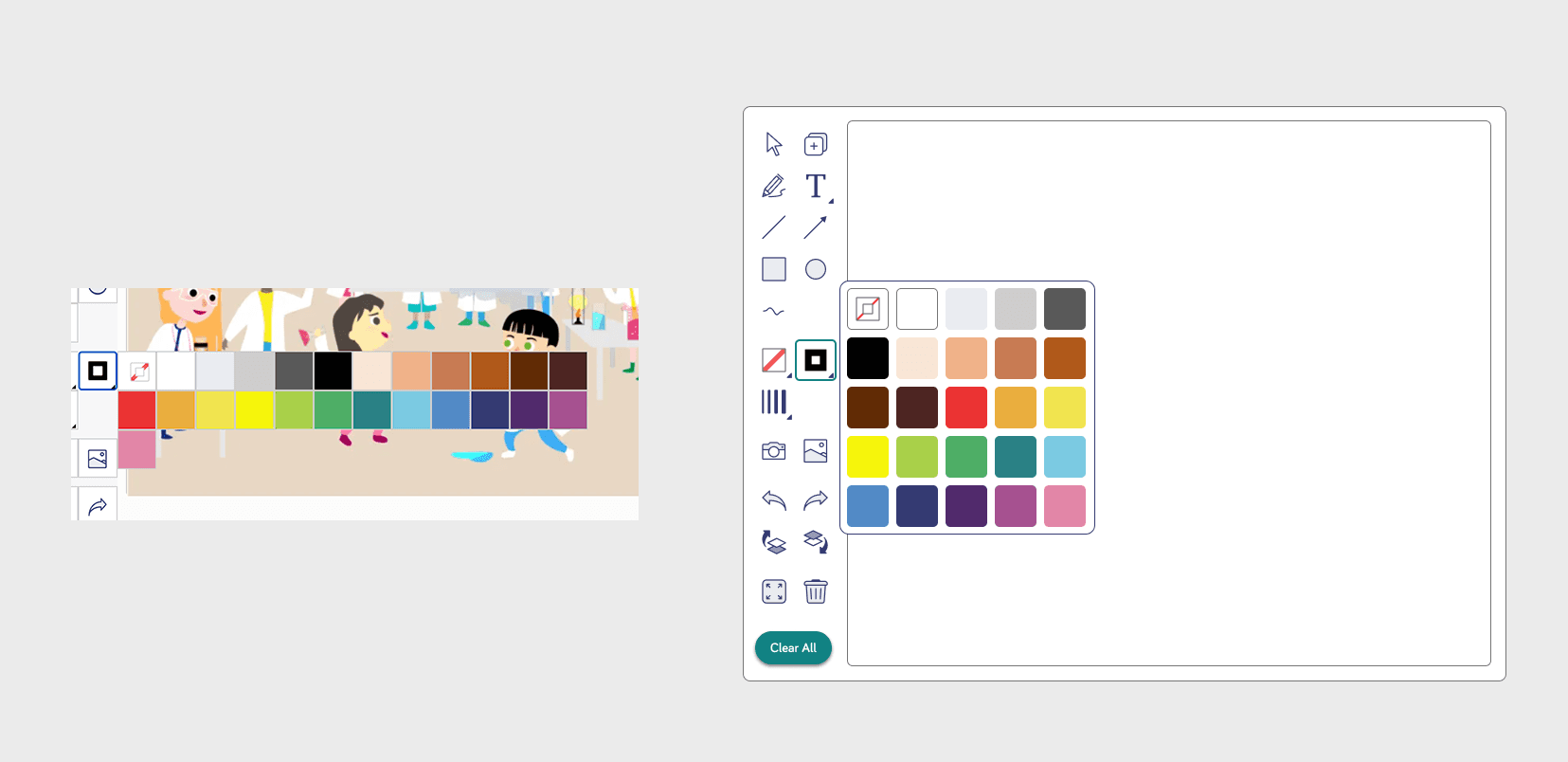
Contrast failures across the toolbar. States that weren't visually distinct from one another. A colour picker that broke reflow at small viewport sizes. I fixed them. Redesigning the palette resolved the reflow problem.
The turn
That was the moment the job got more interesting. Every issue on my list was closed. The tool met the criteria. And it was still, by any reasonable measure, difficult to use.

The read
I went through the tool as a student would. A long list of tools with no grouping. Functions duplicated across multiple controls. Complex interactions between tools that nothing explained. A canvas small enough to be difficult on a phone. No way to zoom.
None of this was in the audit, because none of it is a compliance failure. It's a usability failure, and the audit was never going to catch it. This part was my own assessment rather than user research. I want to be clear about that. What I had at this point was a designer's read of a tool I'd spent weeks inside.

The one I couldn't fix
The tool wasn't keyboard accessible and didn't support reflow well enough for students using assistive technology to complete the drawing activities. That's a rebuild, not a fix.
So I designed a viable alternative: students who couldn't access the activity could toggle to a quiz demonstrating the same learning. Our auditor signed it off as a permitted exemption, which bought us time. It worked, and I was never comfortable with it. Those students were doing a different activity rather than the same one. That exemption is the reason the rest of this work exists.
03 / The Obvious Answer
I know Rome wasn't built in a day
04 / The Decisions
A better arrangement of the same fifteen controls is still fifteen controls.
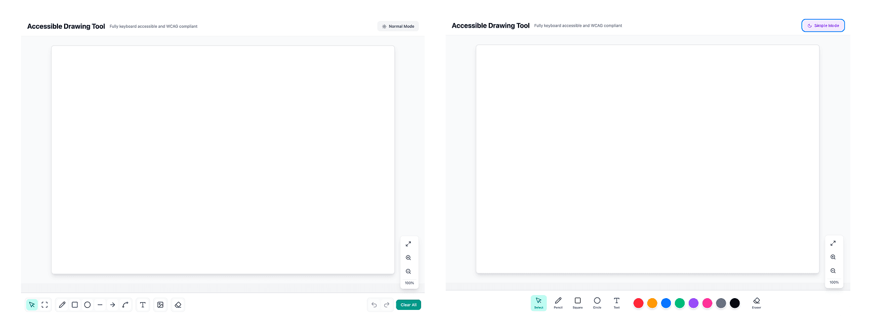
I grouped tools logically, moved settings to contextual controls that appear next to what you're editing, sized the shape previews to represent their actual output, and added zoom. The toolbar went from a wall of icons to seven groups.
Arrow keys moving a cursor pixel by pixel is expressive and unusable.
My first keyboard drawing attempt was an Etch A Sketch model. Arrow keys nudge a point, the line follows. It worked, and crossing the canvas took forever. So I moved it onto a grid. Each keypress moves a cell rather than a pixel, which makes traversal fast enough to be practical. I also borrowed the tab pattern keyboard users already know, so getting to a region of the canvas doesn't mean travelling there one step at a time.
A keyboard can't give you the continuous input that free-hand drawing needs.
Rather than chase parity with the mouse, I scoped the keyboard toolset to what the curriculum actually asks students to draw: squares, circles, straight lines, arrows, bezier curves, text. That covers labelled diagrams and observational sketches, which is the majority of these activities. Free-hand still exists via the grid-stepped pencil, but it produces staircases rather than curves, and I don't yet know whether that trade is acceptable to students. I kept it in the build specifically so people could try it and react.
Permanent grid lines turn every canvas into graph paper.
The grid shows when a keyboard user is actively placing something and clears the moment they leave the canvas. Mouse users never see it. The scaffolding is there when it does work and gone when it doesn't.
A separate build for younger users is a separate build to maintain.
I specified the interface so that control size, spacing, and toolset are configuration rather than layout. That decision is what makes the next section possible without a second codebase.
05 / What That Unlocked
Building the accessible version surfaced a second problem, one the audit never raised. If the tool was overloaded for an adult, it was worse for the youngest learners.
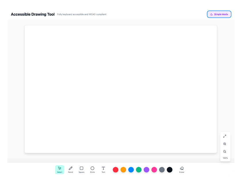
Because the UI scales, a younger-learner variant is a configuration rather than a rebuild. In the prototype it's a toggle. The variant reduces the toolset to what a k-2 task needs, surfaces colour directly instead of behind a picker, labels every tool rather than relying on icon recognition, and scales the targets up.
On the target size
Every touch target standard is calibrated to adults, from WCAG's 24px floor to Material's 48. Nielsen Norman Group recommend four times the area for young children. I spec'd 64px, which sits above the adult baselines and below the NN/g figure, and it needs validating rather than defending.
On the toggle
The prototype uses a Normal / Simple switch so I could show both states on one screen. That's a demo affordance, not the product model. A child would never pick a mode or be told they're on the simple one. My thinking is that the interface is served by age band rather than chosen: a purpose-designed build for k-2, reduced controls and larger targets for 3-5, more tools introduced through middle school. The banding, and which tools belong at which age, is a direction that needs UXR and Curriculum Development to confirm.

05 / What That Unlocked
4
Users, aged 8 to 12
3
Tasks each
Four users, three tasks each: draw a flower, annotate a provided drawing, and freestyle. The interaction held. Users completed the directed tasks.
The freestyle task was the interesting one. Given no target, most users spent the time working out what each tool did rather than drawing. A few made houses and a car. Everything else was exploration. That's a ten to fourteen year old cohort auditing the toolset, which is the same overload behaviour I'd argued about for younger learners, showing up in an age group that should be past it.
A couple tried the keyboard pencil unprompted and drew shapes with it. That tells me the interaction is findable. It doesn't tell me whether grid-stepped drawing is good enough, which is still an open question.
What this testing doesn't cover
NN/g's research puts fine motor skills as well developed by nine to twelve. My cohort sat just outside/inside that band, which is partly why the interaction worked. The younger the user, the less this testing tells me, and the youngest band is exactly where the age-variant thinking is least proven.
07 / What's Still Open
Grid density
Too few points and students can't draw anything with detail. Too many and a keyboard user is pressing arrow keys dozens of times to cross a canvas. I think the answer is letting users choose, though that adds a setting to an interface whose whole argument is fewer decisions. It needs UXR.
Target size
64px is a working number, not a validated one.
Age banding
The three-tier direction (k-2, 3-5, middle school) and the tool set at each age come from discussion, not research. Confirming it needs UXR and Curriculum Development.
Output parity
A mouse user drawing with the pencil gets a curve. A keyboard user gets a staircase. Both complete the task. They don't produce the same thing, and I'd want to be honest with teachers about that.
The younger-learner variant
Designed, not tested. K-2 users haven't seen it.
08 / Where It Is Now
The quiz was never the goal. It was the thing we built because we couldn't do better yet. Now we can.